Saturday, 11 October 2014

Team VeloEtoile: Animation research of cyclists

 I had a look at two of the many cyclists that Alison recommended for research, Mark Cavendish and Alberto Contador.

Firstly, I examined Cavendish's form through the power of youtube, I examined how the cyclist's body moves in conjunction with the bicycle.


I found that when the cyclist accelerates, the bike sways and tilts - making it more unbalanced but builds momentum.

Thursday, 9 October 2014

Old lady concept

I started to sketch out some rough concepts for the old lady character in Emma's animation. I really liked the protagonist's personality, so it was too good an opportunity to pass by!

For some reason, it turns out I really liked sunglasses, big perms and hats. I keep imagining her as some wacky, colourful character who just likes to live as she pleases.

Animation research for old lady


I've been told to do research on movement since I'm an animator.
This is reference for Emma's old lady character.

To start myself off, I found a youtube video of an old couple walking and examined the walk style of the old woman.

I found that the movement is very minimal, the foot seems to almost slide because its not lifted very high. The cane also serves as supporting most of her weight and is firmly planted. At 0:06, the cane appears to be more slanted than her left leg - if the cane had slanted a bit more, she would've slipped. The walk as a whole feels quite delicate, it seems like any wrong movement could cause a fall. She seems to hobble as her feet take turns supporting her weight.

I drew some sketches to help me and focused primarily on the feet.

Thursday, 2 October 2014

Some rough concept of the visual style. Simple and messy.

Wednesday, 1 October 2014

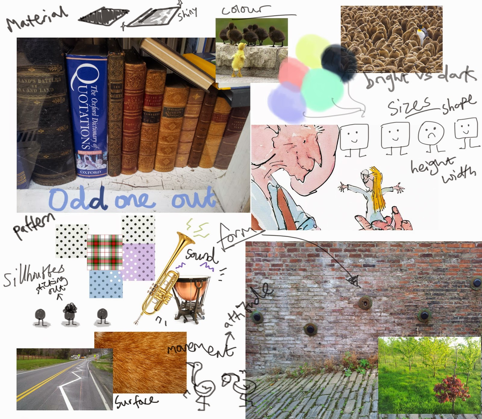
I want the visual approach of tiny vs ginormous.

Why monsters?
Because they tend to be synonymous with 'nightmares' or 'scary.'
The term 'monster' is used to describe a vague variety of strange, fictitious creatures created from myths and stories. More often than not, a child were claim to have a 'monster under their bed'. This is the cause of stories told to the child, to scare them into not doing something or stemming from imagination, and would usually evolve into nightmares. In this sense they are being 'bullied by the monsters' as they are helpless against it. Thus, the parent will read the child to sleep or comfort the child. The parent is typically seen as the savior which has 'stopped the monsters'. 

Placing something tiny amongst these intimidating creatures creates a nice juxtaposition and transforms the tiny being as almost 'weak-looking' because of the size difference.
Of course, in the famous cliche the tiny defeats the big and is seen as brave in the end. The example of fighting the 'Big Bad' is most commonly used to convey the likes of good and evil, but I've used monsters as a story-telling device to visually display 'conquering a fear'.

I wanted to tell the story of overcoming obstacles (e.g the parent monster competing against all the bigger monsters) and the struggle of a parent wanting to restore hope in their child.
However, the idea of revolving around a world of monsters is not fixed and can be altered.

Themed Moodboards

Themes presented in the story: bravery, helplessness and being the 'odd one out'. 
 
I took a few photographs as primary sources but the collages are dominated mostly by secondary sources to convey the topics.

Bravery in society can be very subtle sometimes. I tend to see bravery as people being able to 'pick themselves up' and walk into danger - regardless of them knowing or not knowing what's coming.

The definition of being helpless is being "unable to defend oneself or to act without help."

Being bound to something, unable to escape - as if your hands were tied. Or, the simulation of drowning where your whole body is literally being pulled down by the ocean.

Socially, we can feel helpless because it feels like we cannot act. The fact of being "unable to defend oneself" can appear everywhere, no matter how subtle.

Registering something as the 'odd one out', translates to the eye seeing something different amongst a crowd.

Visually, our eye catches anything that contrasts.
If the different characteristics of the 'odd one' is subtle, it suggests more of a hidden or lacking feature from that certain individual.
Using juxtaposition by exaggerating the feature, or trait, allows the viewer to know who is the 'odd one' at a glance.

I took a few photographs to explore in what ways I could display this.

Rough concept of the art; soft, pastoral colours with simple lines. 

(Lines and colours are quite messy to convey a naive attitude)